Data visualisation: Difference between revisions
imported>Russell D. Jones (moving) |
mNo edit summary |
||
| (15 intermediate revisions by 4 users not shown) | |||
| Line 1: | Line 1: | ||
{{subpages}} | |||
{{Authors|Andrew Watson|others=y}} | |||
'''[[Data]] visualisation''' is the graphical representation of data. It is a technique to convert data to [[information]] by displaying the data using graphics, such as charts, plots and tables. | |||
It should convey information in a simple manner, that takes little effort from the reader to understand. Studies have shown data represented graphically is understood and remembered better than the same by text.<ref>{{cite web|url=https://www.bbc.co.uk/news/business-17682294|title="Pretty pictures: Can images stop data overload?"}} </ref> Therefore, effective data visualisation should be clear and simple to the reader. | |||
Effective data visualisation requires a combination of skills. Designing an effective visualisation is both an art and a science. | |||
Data visualisation art is part of the design process, requiring a good knowledge of fonts and colours. | |||
Data visualisation science covers: | |||
* the information to convey; a critical part of data visualisation is the reason for creating the visualisation, the intended message(s) the visualisation should provide | |||
* the technical aspect of sourcing data and building the visualisation | |||
* the design; for example the most appropriate chart type to provide the key information | |||
== Types of Data Visualisation == | |||
Common types of data visualisation are dashboards and infographics. | |||
=== Dashboards === | |||
{{Image|Data-visualisation-example-charts.PNG|right|350px|Examples of charts used in dashboards}} | |||
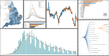
Dashboards are usually found in commercial environments. They are used to provide business information to people who require information for making business decisions and for carrying out their day jobs more effectively. | |||
Often dashboards are a form of interactive data visualisation. They enable the user to interrogate the visualisation as they use it, being able to answer multiple business questions using the same dashboard. | |||
The goal of a corporate dashboard being to answer relevant business questions with as little effort as possible on behalf of the user. | |||
Dashboards are usually built by people with a strong commercial awareness and the developers interact very closely with the intended dashboard users. | |||
=== Infographics === | |||
Infographics are more commonly seen in the public realm. They are produced to convey a message in an attractive manner and are generally made for public consumption. Often used for marketing, infographics cover many topics and tend to be far more visually appealing than dashboards. | |||
Professional graphic designers create infographics<ref>{{cite web|url=https://visual.ly/product/infographic-design|title=Visual.ly Infographic design}}</ref> and often the target audience is a section of the public, hence there can be little interaction between the designer and the reader. | |||
The popularity of data visualisation has produced 2 whole new industries; corporate dashboard developers and infographics developers. | |||
== Components of Data Visualisation == | |||
There are many chart types used within data visualisations. Some are well known and easy to understand, others are less used. | |||
Simple and common chart types include: | |||
* [[Line chart]] | |||
* [[Bar chart]] | |||
* [[Pie chart]] | |||
* [[Histogram]] | |||
* [[Heatmap]] | |||
* [[Table]] | |||
* [[Treemap]] | |||
Less used chart types include: | |||
* [[Dendrogram]] | |||
* [[Waffle chart]] | |||
* [[Radial chart]] | |||
* [[Rose chart]] | |||
* [[Spider chart]] | |||
* [[Violin chart]] | |||
* [[Sankey chart]] | |||
== History of Data Visualisation == | |||
{{Image|Persons-With-Gainful-Occupations-and-Attending-School-in-1870.jpg|right|350px|A panel chart with treemaps from 1870s}} | |||
Although data visualisation has boomed in recent times, largely thanks to improving computing power and the introduction of new software, it is not a new concept. | |||
The first documented data visualisation is in the [[Turin Papyrus Map]], tracked back to 1160 B.C. | |||
However, there were many limitations of printing until more recent times. | |||
Therefore, not until the 19th Century are there numerous references to data visualisation. | |||
[[William Playfair]] first developed the pie chart in 1801. | |||
[[Florence Nightingale]], although famous for revolutionising nursing, was a statistician. She used bar charts and the rose chart (also known as a “coxcomb”). | |||
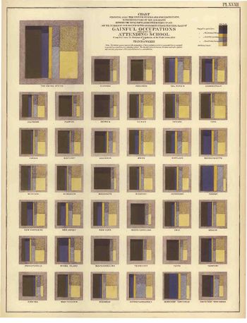
Small multiple charts, heatmaps and violin charts were all appearing in publications in the 1800s.<ref>{{cite web|url=https://www.loc.gov/resource/g3701gm.gct00297/?sp=2&st=gallery|title="Statistical atlas of the United States based on the results of the ninth census 1870"|}}</ref> | |||
== Marketplace == | |||
The marketplace for data visualisation software is highly competitive, however, it is dominated by a few large players. | |||
The research and advisory company [[Gartner]] publishes a survey of the market every year and, in 2020, the leaders are Microsoft Power BI and Tableau.<ref>{{cite web|url=https://info.microsoft.com/ww-landing-2020-gartner-magic-quadrant-for-analytics-and-business-intelligence.html|title="Gartner magic quadrant for analytics and business intelligence platforms"}} </ref> | |||
There are a number of competitors in the market investing strongly to improve their product and market share. | |||
For example, in August 2019 Salesforce purchased Tableau.<ref>{{cite web|url=https://investor.salesforce.com/press-releases/press-release-details/2019/Salesforce-Completes-Acquisition-of-Tableau/default.aspx|title="Salesforce completes acquisition of Tableau"|}}</ref> | |||
In February 2020 Google acquired Looker, one of the up-and-coming data visualisation companies.<ref>{{cite web|url=https://techcrunch.com/2020/02/13/google-closes-2-6b-looker-acquisition|title="Google closes Looker acquisition"|}}</ref> | |||
<references/>[[Category:Suggestion Bot Tag]] | |||
Latest revision as of 16:01, 4 August 2024
Authors [about]:
join in to develop this article! |
Data visualisation is the graphical representation of data. It is a technique to convert data to information by displaying the data using graphics, such as charts, plots and tables.
It should convey information in a simple manner, that takes little effort from the reader to understand. Studies have shown data represented graphically is understood and remembered better than the same by text.[1] Therefore, effective data visualisation should be clear and simple to the reader.
Effective data visualisation requires a combination of skills. Designing an effective visualisation is both an art and a science.
Data visualisation art is part of the design process, requiring a good knowledge of fonts and colours.
Data visualisation science covers:
- the information to convey; a critical part of data visualisation is the reason for creating the visualisation, the intended message(s) the visualisation should provide
- the technical aspect of sourcing data and building the visualisation
- the design; for example the most appropriate chart type to provide the key information
Types of Data Visualisation
Common types of data visualisation are dashboards and infographics.
Dashboards
Dashboards are usually found in commercial environments. They are used to provide business information to people who require information for making business decisions and for carrying out their day jobs more effectively.
Often dashboards are a form of interactive data visualisation. They enable the user to interrogate the visualisation as they use it, being able to answer multiple business questions using the same dashboard.
The goal of a corporate dashboard being to answer relevant business questions with as little effort as possible on behalf of the user.
Dashboards are usually built by people with a strong commercial awareness and the developers interact very closely with the intended dashboard users.
Infographics
Infographics are more commonly seen in the public realm. They are produced to convey a message in an attractive manner and are generally made for public consumption. Often used for marketing, infographics cover many topics and tend to be far more visually appealing than dashboards.
Professional graphic designers create infographics[2] and often the target audience is a section of the public, hence there can be little interaction between the designer and the reader.
The popularity of data visualisation has produced 2 whole new industries; corporate dashboard developers and infographics developers.
Components of Data Visualisation
There are many chart types used within data visualisations. Some are well known and easy to understand, others are less used. Simple and common chart types include:
Less used chart types include:
History of Data Visualisation
Although data visualisation has boomed in recent times, largely thanks to improving computing power and the introduction of new software, it is not a new concept.
The first documented data visualisation is in the Turin Papyrus Map, tracked back to 1160 B.C.
However, there were many limitations of printing until more recent times.
Therefore, not until the 19th Century are there numerous references to data visualisation.
William Playfair first developed the pie chart in 1801.
Florence Nightingale, although famous for revolutionising nursing, was a statistician. She used bar charts and the rose chart (also known as a “coxcomb”).
Small multiple charts, heatmaps and violin charts were all appearing in publications in the 1800s.[3]
Marketplace
The marketplace for data visualisation software is highly competitive, however, it is dominated by a few large players.
The research and advisory company Gartner publishes a survey of the market every year and, in 2020, the leaders are Microsoft Power BI and Tableau.[4]
There are a number of competitors in the market investing strongly to improve their product and market share.
For example, in August 2019 Salesforce purchased Tableau.[5]
In February 2020 Google acquired Looker, one of the up-and-coming data visualisation companies.[6]
- ↑ "Pretty pictures: Can images stop data overload?".
- ↑ Visual.ly Infographic design.
- ↑ "Statistical atlas of the United States based on the results of the ninth census 1870".
- ↑ "Gartner magic quadrant for analytics and business intelligence platforms".
- ↑ "Salesforce completes acquisition of Tableau".
- ↑ "Google closes Looker acquisition".

